
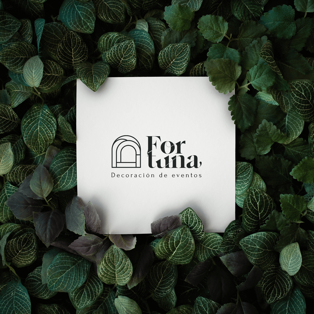
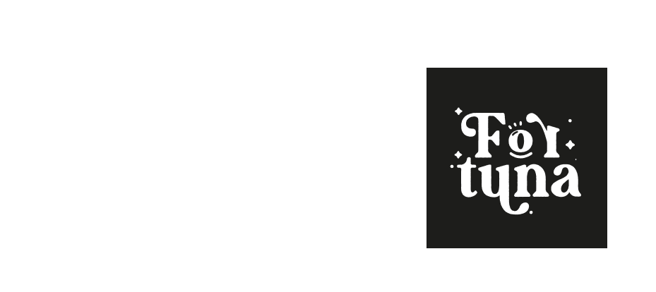
Fortuna
Brand design
About this project
This brand was created to represent a team of creators dedicated to provide props and assets needed to the decoration of events. They create the structures that holds all the decoration used to get the fancy look and feel. The team is managed by architects, landscapists, and indoor designers.
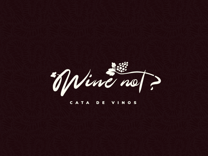
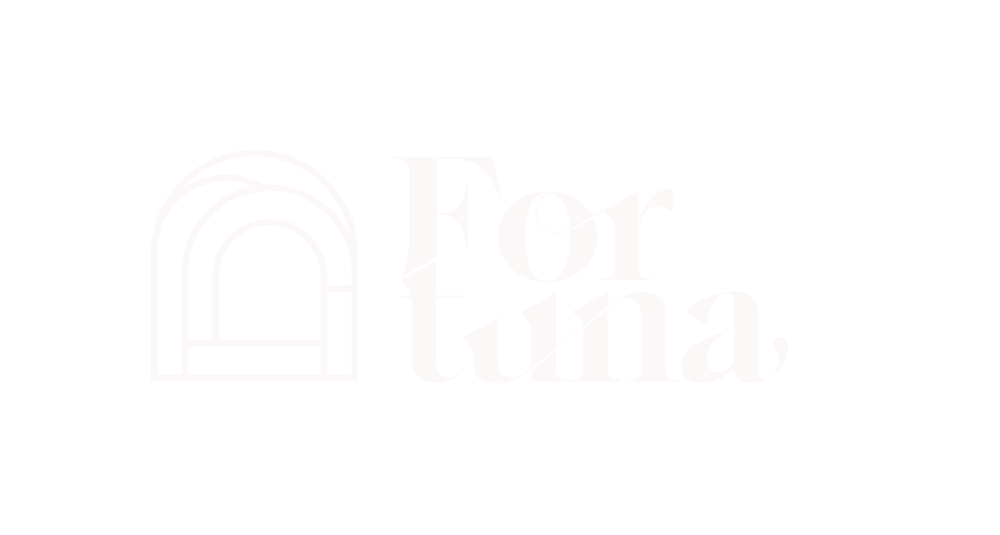
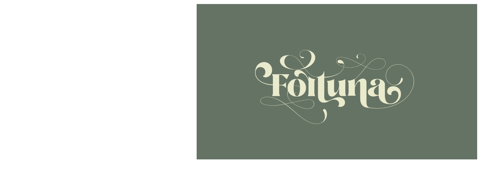
The logo

The process
To design this brand, the work was distributed in 3 phases needed to get the proper knowledge about the client. The first is about research and understanding, the second one is about designing and creating, and the third one is to get this brand placed into the needed applications.
Phase 1:
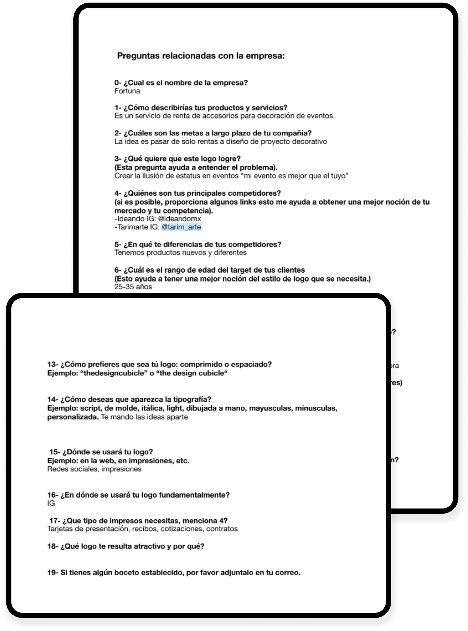
In order to design a brand properly, a set of steps are required to understand the business and the client's needs, likes and
Survey/ interview:
The first step is to understand the user by a quick survey guided by a casual interview and started by asking some easy questions, then hear the client and see what their business is/will be about. things like what they like, elements they've seen around, the type of colors they prefer, and other things to try and understand the target user and start defining the brand.
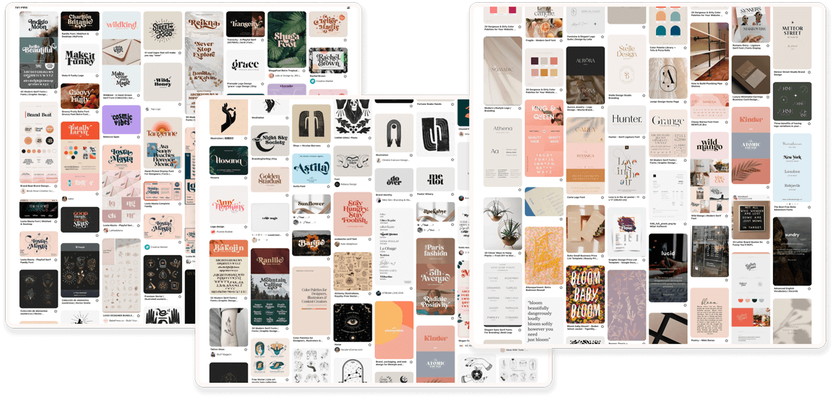
A mood board:
To get the mood of the brand, a Pinterest board was created to help research new elements, colors, and typographies to compose the brand.
Competitive analysis:
A good practice is to analyze the competitors, how they work the styles they use and how they managed to arrange all the assets to compose their brand. in this case, Instagram was the reference of this business because this is the main channel that was thought to be used the most.
With these exercises, we managed to define the foundations to start drafting and trying our first iterations.
Phase 2
Logo profile/ Drafts:
We had enough information to create the following adjectives in order to start shaping and drafting the logo :
- Typographic
- Hand crafted
- Human
- Mystic / Magic
-Elegant / Expensive
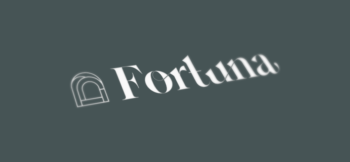
Typography selection for the name:
A catalog of typographies which were using a hybrid style from serif and script was made, then worked on the selected options to create the logo name design:
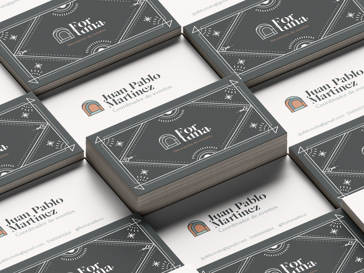
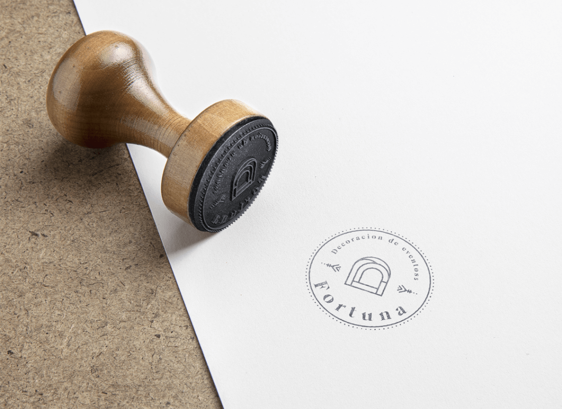
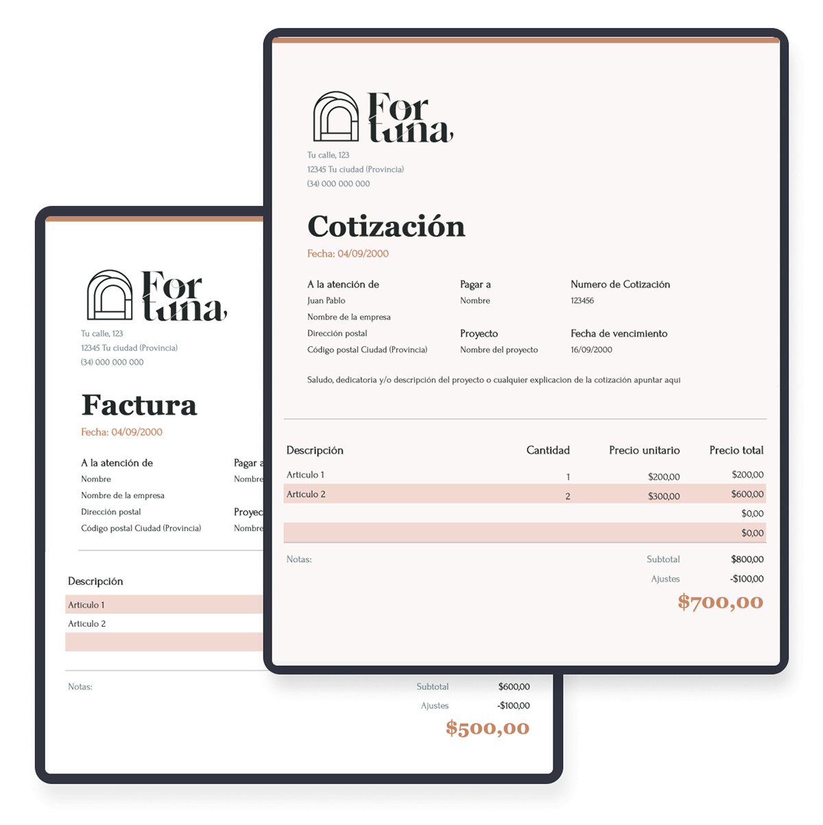
Logotype Applications:
The main items needed to start were presentation cards, an email signature, and a digital/printed flyer to communicate any future wine tasting events