
Via Novum
Brand design, Web design
About this project
This is a company dedicated to the growth of organic food using high technologies to provide supermarket demand with high efficiency.
The challenge was to outstand from the rest of the commercial brands and let the user fall in love with this brand and try this new product offer :)
Before I started to draft and design
I made some research about the food market segment to design a new, but fresh and friendly-looking brand. The idea was to represent a new way of consuming farming organic products.
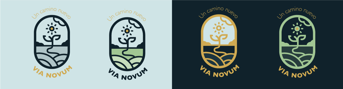
The logo
According to the applications needed, there are several types of ratios for this logo:
This horizontal version, uses the traditional ratio, with a 3x2 square ratio to be in printed material or digital screens like a website
A vertical version to give the logo a bigger emphasis on the brand´s isometric, though for smaller usage like labels or stickers

These are alternative usage options to give the logo a little more usage flexibility.

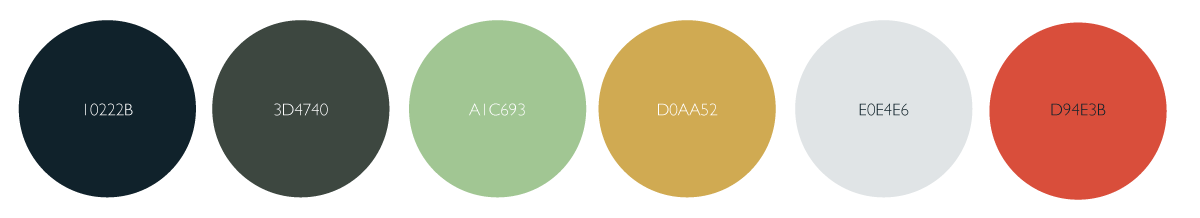
Color Pallete
A mixture of Emerald, olive, mustard, soft blue, and lemon green was used to present this brand
Typography:
The logo is composed by a very popular font: Gill Sans, a Sans Serif font thought to be easy and accessible to read
Logotype Applications:
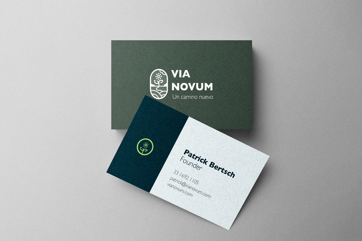
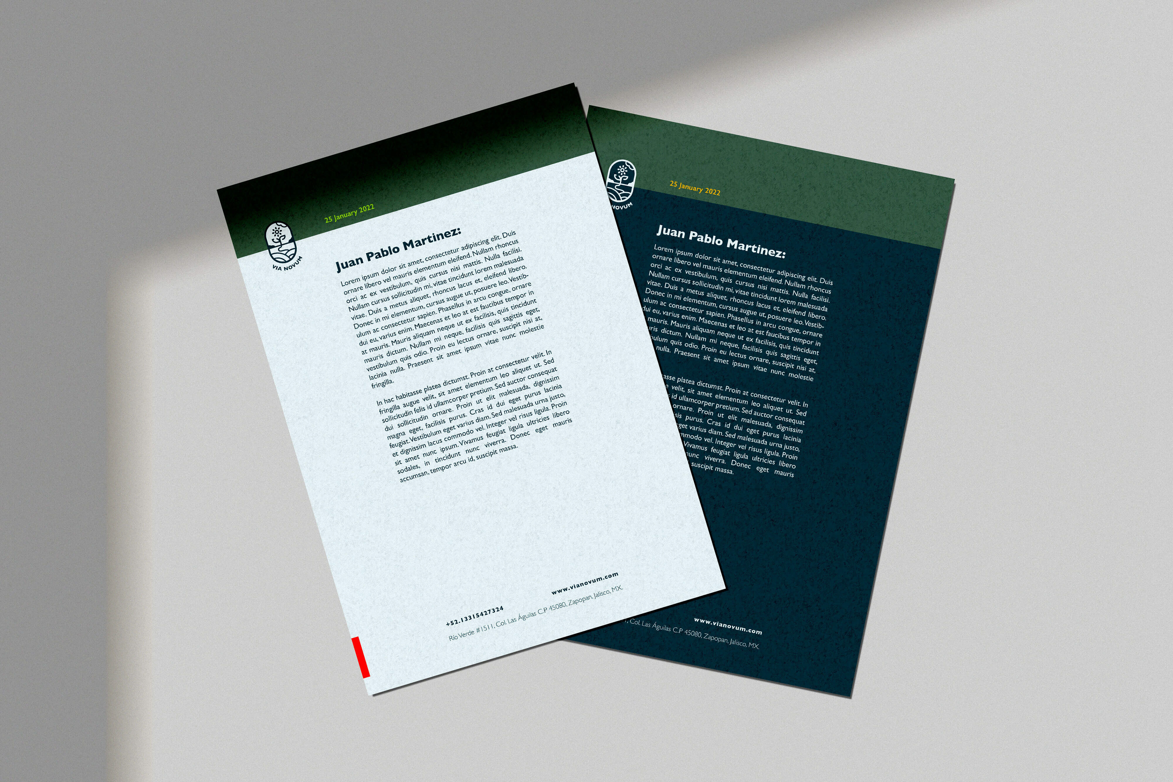
The main items needed to start were presentation cards, a branded sheet, a receipt, and an email signature:
Webpage
A landing page was created to test and prove all the branded elements created for this Logo and also to set the tone for the message to deliver.
Something to let the user that this company makes organic products, but also that is a friendly but professional company that will be useful to the consumer:
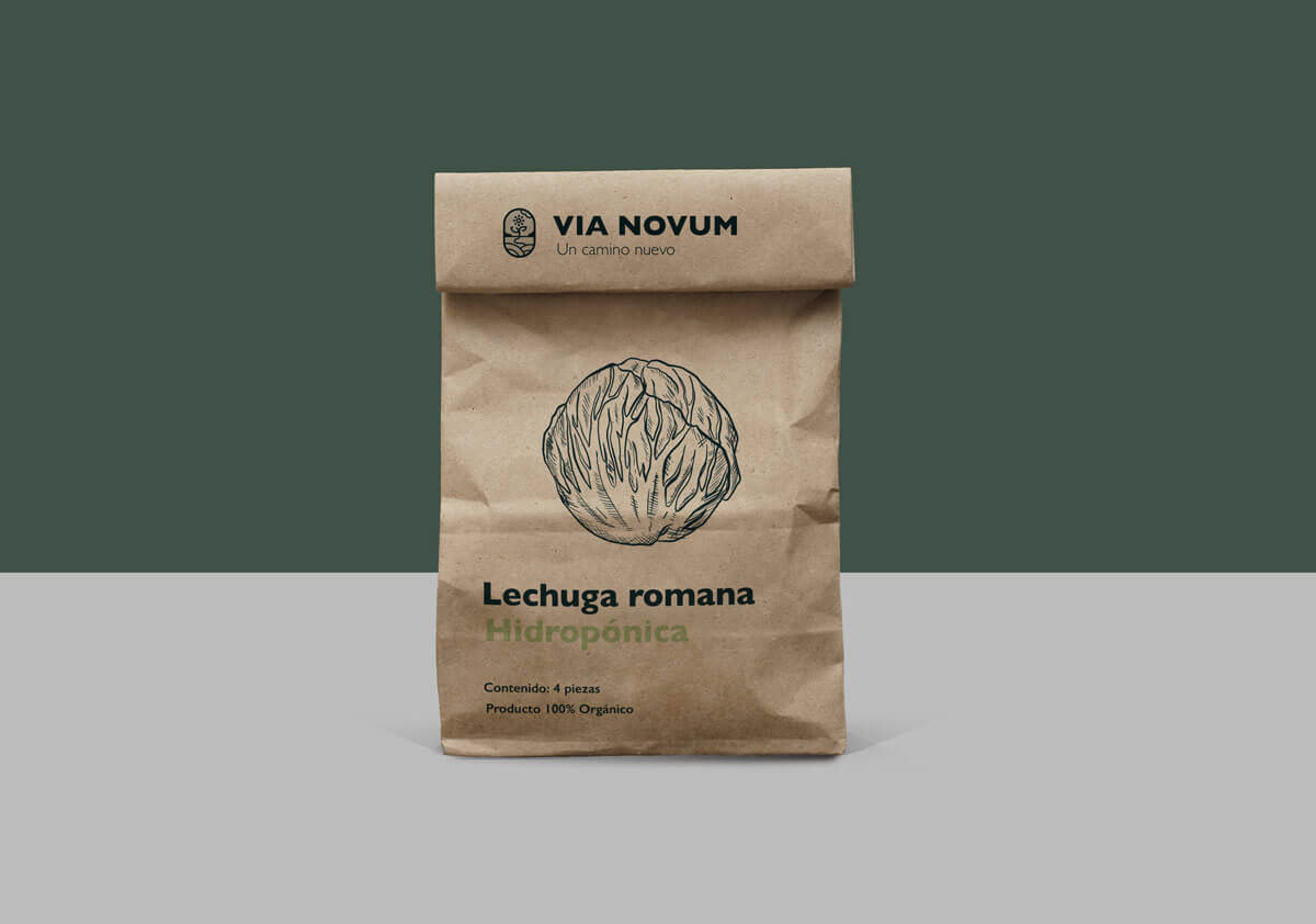
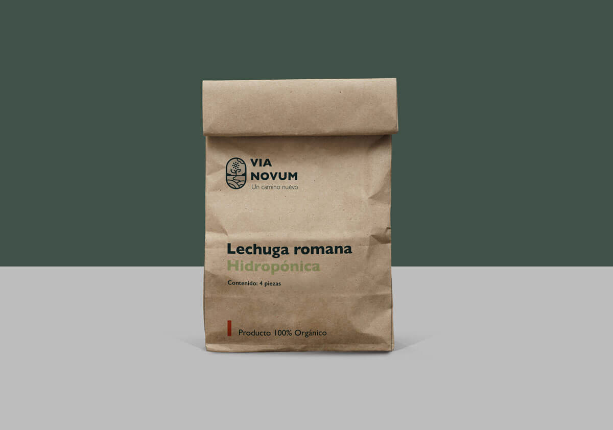
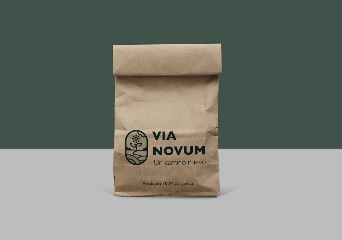
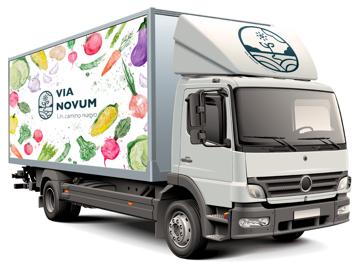
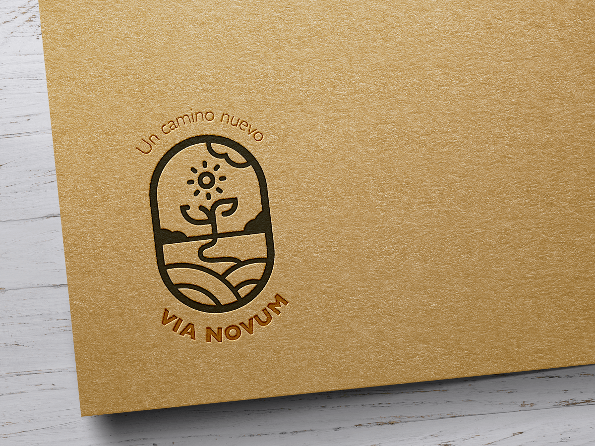
Packaging was thought to be printed in recycled Kraft paper to save resources and avoid plastic materials.