
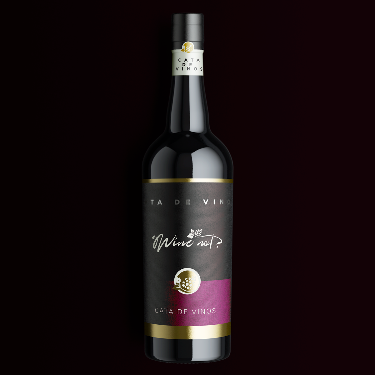
Wine not
Brand design
About this project
This is a company dedicated to do several activities about the wine's universe but their specialty is wine tasting by gathering several people in a restaurant to have dinner, learn about wine, try different types of grapes, and have fun :)
The challenge with this brand was to make their image look like something hand-crafted, human, wine-related, social, and also friendly.
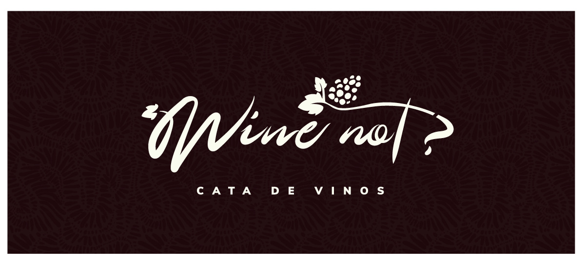
The logo
This logo was created to offer Wine tasting sessions, not a lot of variants but enough for the needs:

Composition
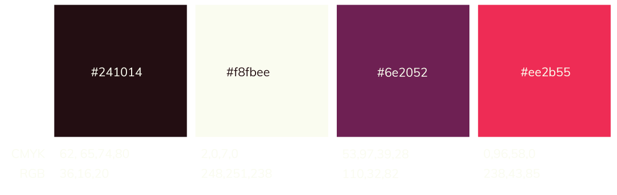
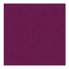
Color Pallete
Red wine colors were used for this logo, pretty straightforward, but makes sense, isn't it?
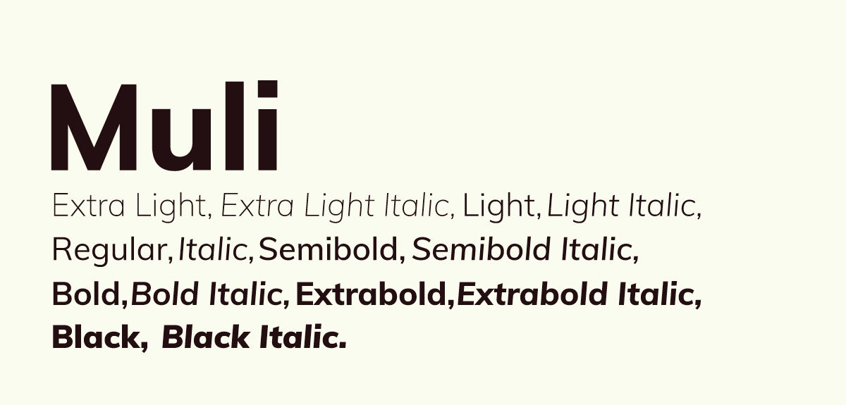
Typography:
The logo uses Muli a sans serif complementary font to be used for any copy needed to compose any work related to this company, some applied on the brand material included on this project.
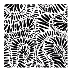
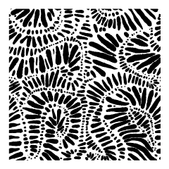
Pattern
A hand-crafted patern was created to ensure visual quality on the brand:
Logotype Applications:
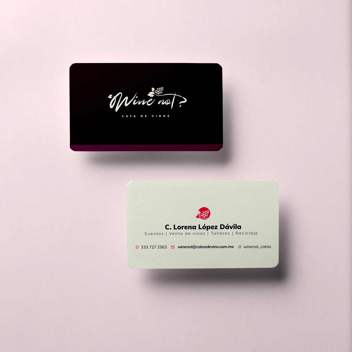
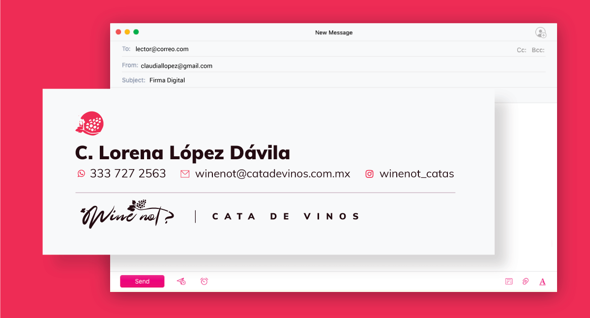
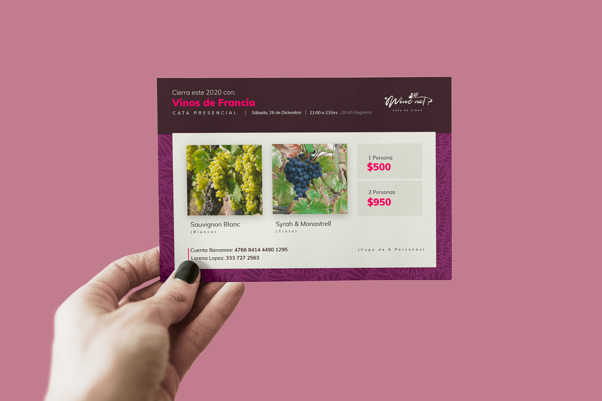
The main items needed to start were presentation cards, an email signature, and a digital/printed flyer to communicate any future wine tasting events